BACK
I'm batman

MAGIC AI (Seed Funded)
Building Touch-First Navigation for a Premium Fitness Device

Problem statement
Personal training is expensive
Personal training costs over £10,000 per month in the UK, putting it out of reach for most people. Magic Mirror was built to solve this—a sleek device that looks like a stylish mirror when off, but transforms into a personal fitness coach when powered on.
The business needed three things: sell more Mirrors, improve the user experience, and support a much larger content library.
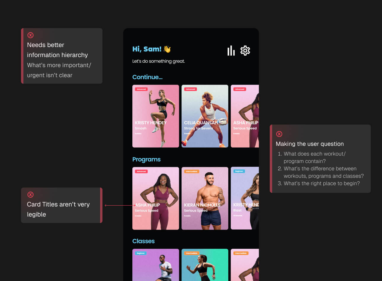
But there was a catch. Even at £1,500, the interface wasn't living up to the premium price point. The homescreen worked fine for a tiny content library (10-15 workouts), but we were about to scale to 40+ programs, classes, and workouts. Users couldn't find what they wanted, and the hierarchy was broken.
Constraints
The Hardware Reality
The Mirror's best feature - being an actual mirror - created my biggest design challenges.
The Mirroring Effect
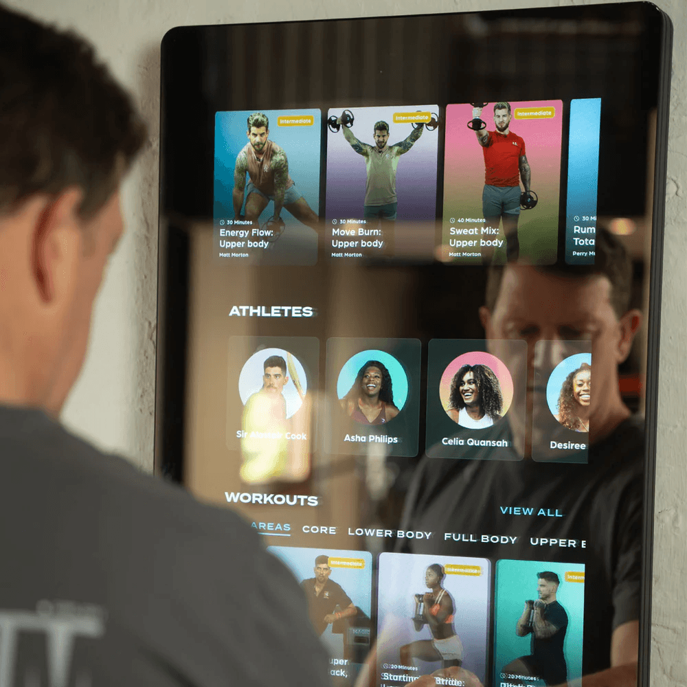
When users exercised at certain angles, they'd see reflections of the screen content overlaid on the display. This meant I had to stick to high-contrast color combinations like blue and white for all text. Subtle greys or low-contrast elements simply disappeared when the mirror effect kicked in.
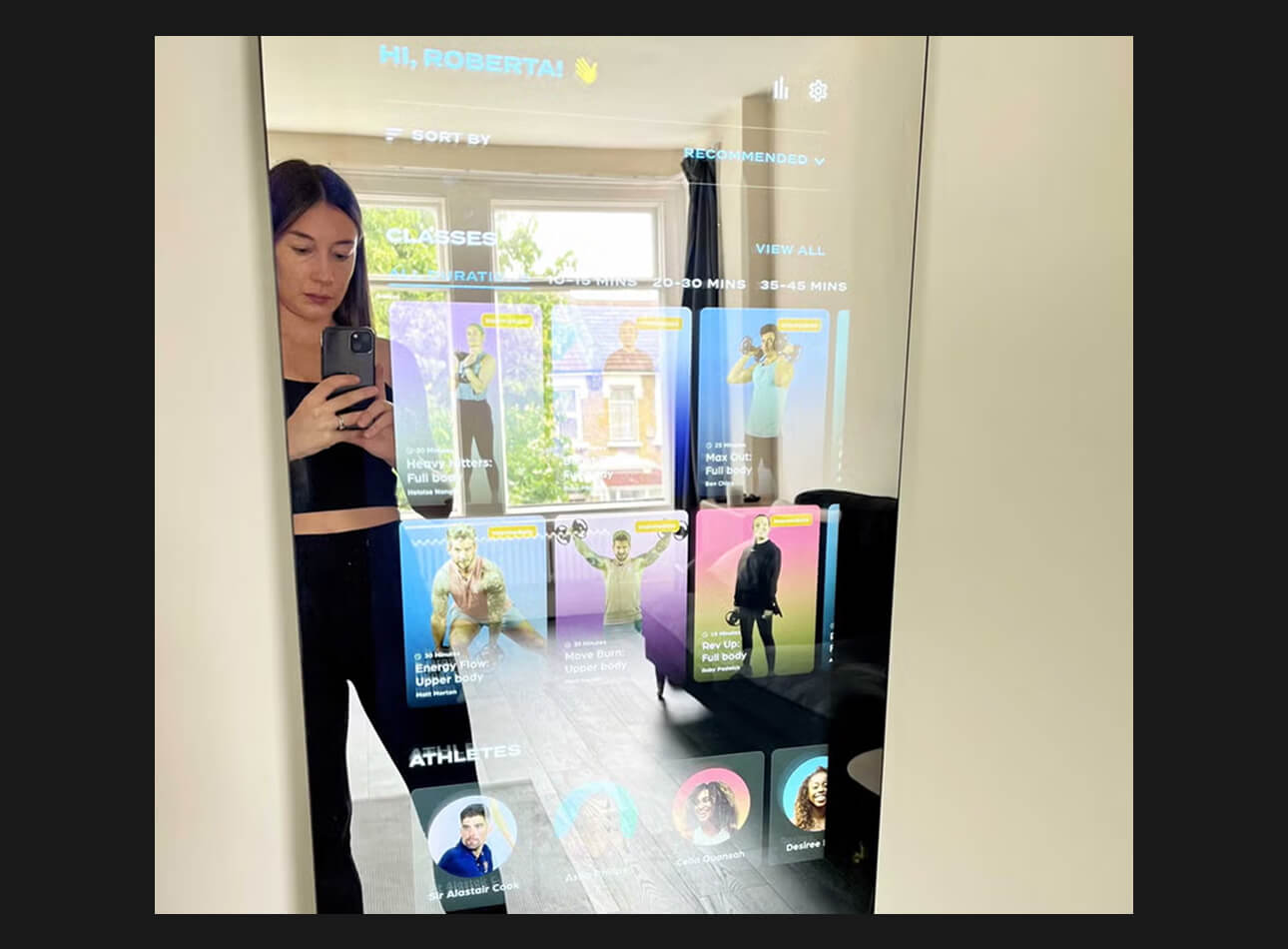
No room for elegant color gradients or sophisticated elevation systems—everything had to be bold and clear.
Human-Scale Touch Targets
The Mirror stands at human height and that meant the most important content had to live at the top - not the bottom like mobile interfaces. Any touch targets placed lower meant users had to bend down mid-workout, which breaks the exercise flow.
This constraint shaped every design decision I made.
My Role
I led the interface redesign as the primary designer, working directly with one engineer and the co-founder. My focus was creating a touch-first navigation system that could scale without overwhelming users mid-workout.
My Approach
Starting with the Foundation: Content Cards
Since cards are how users access and remember their favorite workouts, I tackled these first. The old cards lacked visual hierarchy and didn't help users distinguish between different content types.
The fix: I didn't reinvent the wheel, but made crucial improvements to information hierarchy and visual treatment—all while maintaining the high contrast needed for mirror visibility.
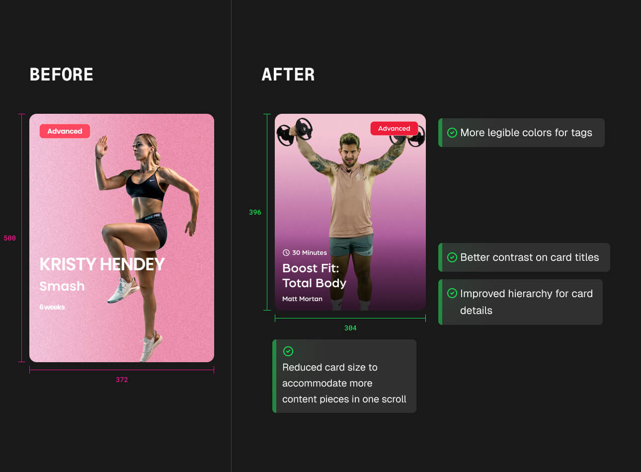
Smart Prioritization Over Feature Bloat
Adding search seemed obvious, but on a full-length mirror, typing mid-workout isn't realistic. Plus, with one engineer, we needed smart trade-offs.
Instead, I focused on contextual navigation:
Made active program cards larger and placed them at eye level since that's the first thing users want when they turn on their Mirror
Created a dedicated filter page where users could dial in specific workout types
Designed the filter levels carefully—the logic mattered more than flashy UI

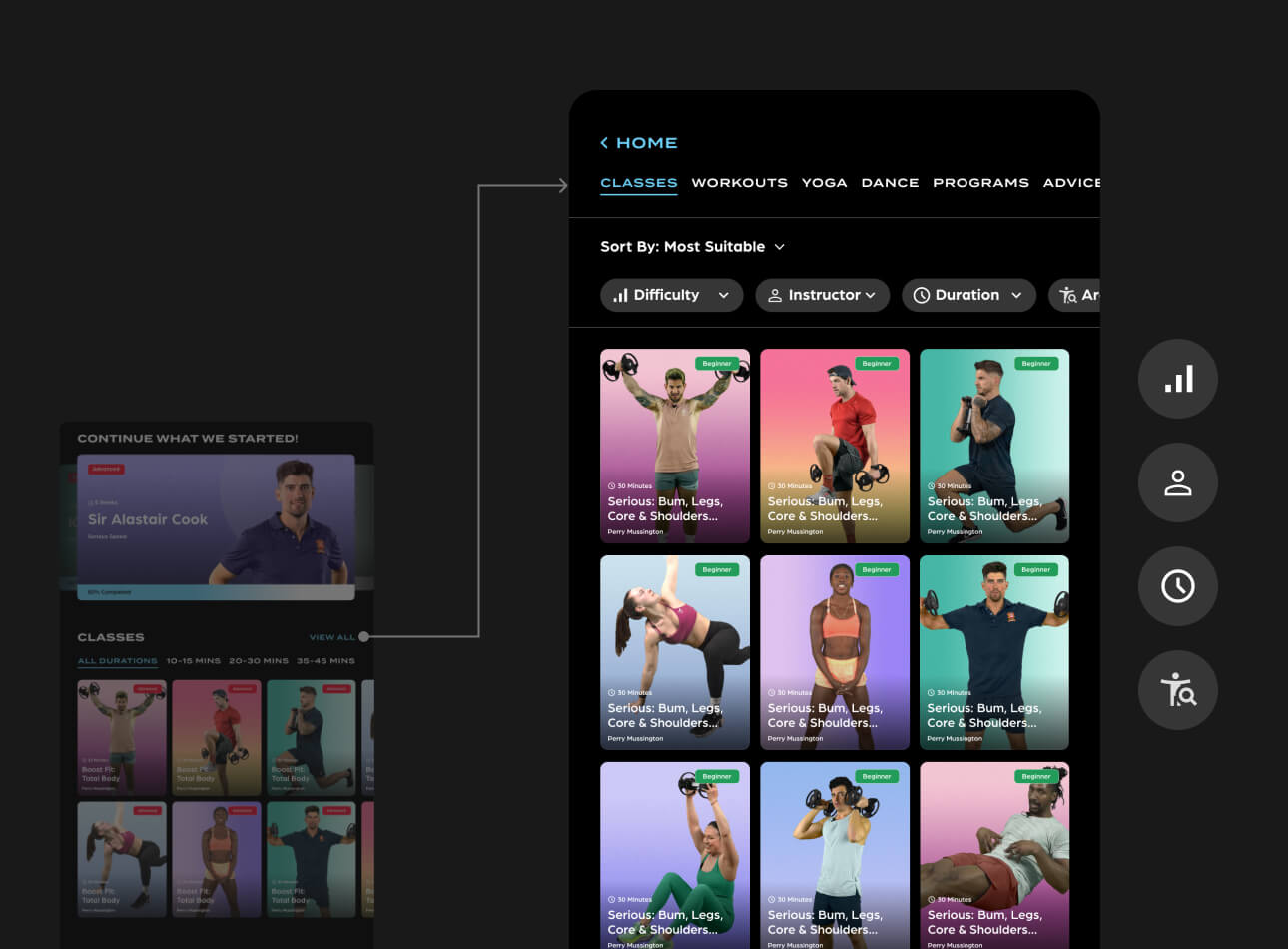
Designing for Touch and Movement
The Mirror isn't just another screen—it's a vertical, full-body interface that people use while moving. The hardware constraints drove every design choice:
Larger, high-contrast touch targets for sweaty fingers and mirror reflections
Top-heavy layout with primary actions in the upper third to avoid bending
Simple tab and filter system that works with quick gestures and maintains contrast requirements

The Result
The new navigation transformed how users discovered content. We went from a cluttered, hard-to-scan home screen to a system that could grow with the content library.
Most importantly: We added a weekly streak feature to keep users motivated—because for a fitness product, forming habits is everything.
The interface now supports 40+ pieces of content without feeling overwhelming, and the touch-first approach makes finding workouts feel natural, not like fighting with technology.
Impact
1. Product Foundation & Growth
Sole designer responsible for all product design, building the design system that scaled Magic from ~2,000 to over 12,000 users.
Created the foundational patterns and UI that enabled the team to launch new features quickly.
My designs powered the launch that helped secure a funding round of £4 million
2. Revenue & Fundraising Impact
Contributed directly to Magic reaching $1M/month in revenue by creating a scalable, premium design foundation.
Design quality was explicitly cited as a key factor in Magic raising its follow-on funding round beyond pre-seed.
3. Recognition & User Perception
Helped Magic earn a spot on TIME’s Best Inventions of 2024, with design cited as part of the product’s appeal.
Elevated user perception: Trustpilot reviews consistently praised the product’s sleek, intuitive experience.
4. Unique Design Challenges Solved
Designed for a hybrid medium (mirror as digital kiosk)—solving challenges like the infinity-mirror reflection and human-scale touch targets.
Balanced hardware + software design considerations, delivering a seamless premium experience that matched the £1,500 price point.
Other case studies
MAGIC AI (Seed Funded)
Building Touch-First Navigation for a Premium Fitness Device
MAGIC AI (Seed Funded)
Designing the AI Personal Trainer Experience


Raft AI (Series B)
How a UX Redesign Concept Transformed Product Strategy

Raft AI (Series B)
UI Components Simplified: Taming the Pack Header Chaos

Raft AI (Series B)
Redesigning the Extraction Table at Raft: Tackling Exception Workflows

Raft AI (Series B)
Redesigning Raft's Document Manager


Sats
Sats - Nigeria's P2P Crypto App

Read
0%