BACK
I'm batman

Raft AI (Series B)
UI Components Simplified: Taming the Pack Header Chaos

Problem statement
We were engineering led. And while that was amazing for tech, it weighed on the user experience.
Here's what would happen -
Customer needs customization → Engineering adds a random button for that specific customer → Chaos for documentation, configuration, and user experience.
We ended up with:
17 different buttons scattered across the pack header
Actions that made sense to one customer but confused everyone else
Simple tasks requiring multiple clicks through a maze of options
Zero logic to where things lived or why
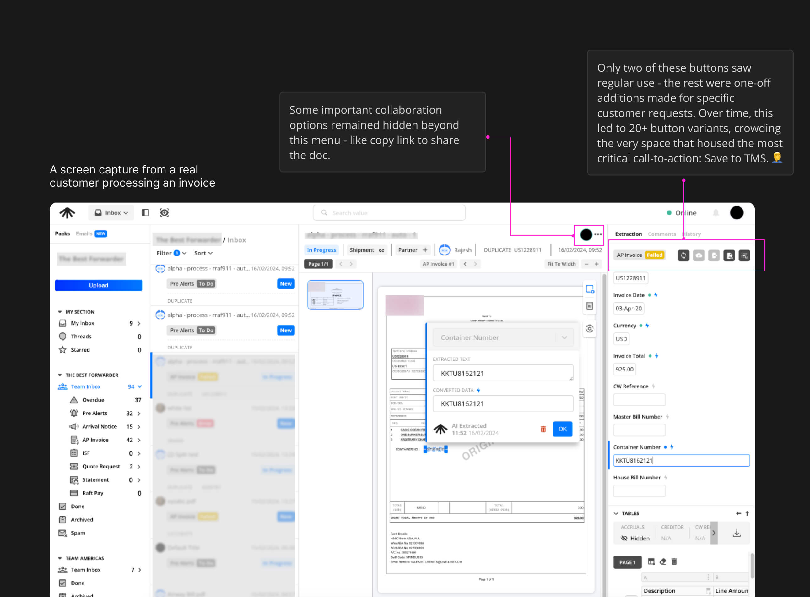
The real issue: Every customer request became a new button instead of thoughtful feature design.
Constraints
Change Aversion - Many users were deeply familiar with existing workflows, making adoption of new patterns an uphill battle.
High Stakes for Errors - Mistakes weren’t just UX bugs; they meant drops in productivity, ML model regression, and direct financial loss for customers.
Screen Real Estate Assumptions - The product was built with large laptop screens in mind, limiting usability for smaller displays or on-the-go contexts.
Heavy Tech Debt - Even minor UI adjustments often required navigating legacy code and complex dependencies, slowing down iteration cycles.
My Role
Lead designer creating components that would be used across all Raft products. This wasn't just about one screen-it was about establishing patterns that could scale.
My Approach
Priority-Based Organization
Moved the most-used actions to the front: copy link, comments, and history.

Primary Actions Front and Center
Validate and Push to TMS became the hero CTAs-large, obvious, and always accessible.
Instead of removing customer-specific features, I grouped them under an "Actions" dropdown. Everyone keeps their functionality, but the interface stays clean.

User Control
Added customization so users could pin their most-needed actions to the quick access area. All of the chaos became user-driven efficiency.
Impact
Reduced clutter by 70%, cutting toolbar actions from 17 scattered buttons to 3 core actions + organized dropdown.
80% of users used the quick actions in their first session.
Support tickets related to ‘finding actions’ dropped by 40% in the first month.
Engineering now reuses the toolbar component system across 4 Raft products, speeding feature rollout.
Customer success teams highlighted improved satisfaction scores on post-training surveys.
Help documentation for the toolbar shrank from 8 pages of feature callouts to 2 concise workflows.
Average time to complete frequent tasks (copy link, add comment) dropped by half.
Other case studies

MAGIC AI (Seed Funded)
Building Touch-First Navigation for a Premium Fitness Device

MAGIC AI (Seed Funded)
Designing the AI Personal Trainer Experience

Raft AI (Series B)
How a UX Redesign Concept Transformed Product Strategy

Raft AI (Series B)
UI Components Simplified: Taming the Pack Header Chaos
Raft AI (Series B)
Redesigning the Extraction Table at Raft: Tackling Exception Workflows

Raft AI (Series B)
Redesigning Raft's Document Manager


Sats
Sats - Nigeria's P2P Crypto App

Read
0%